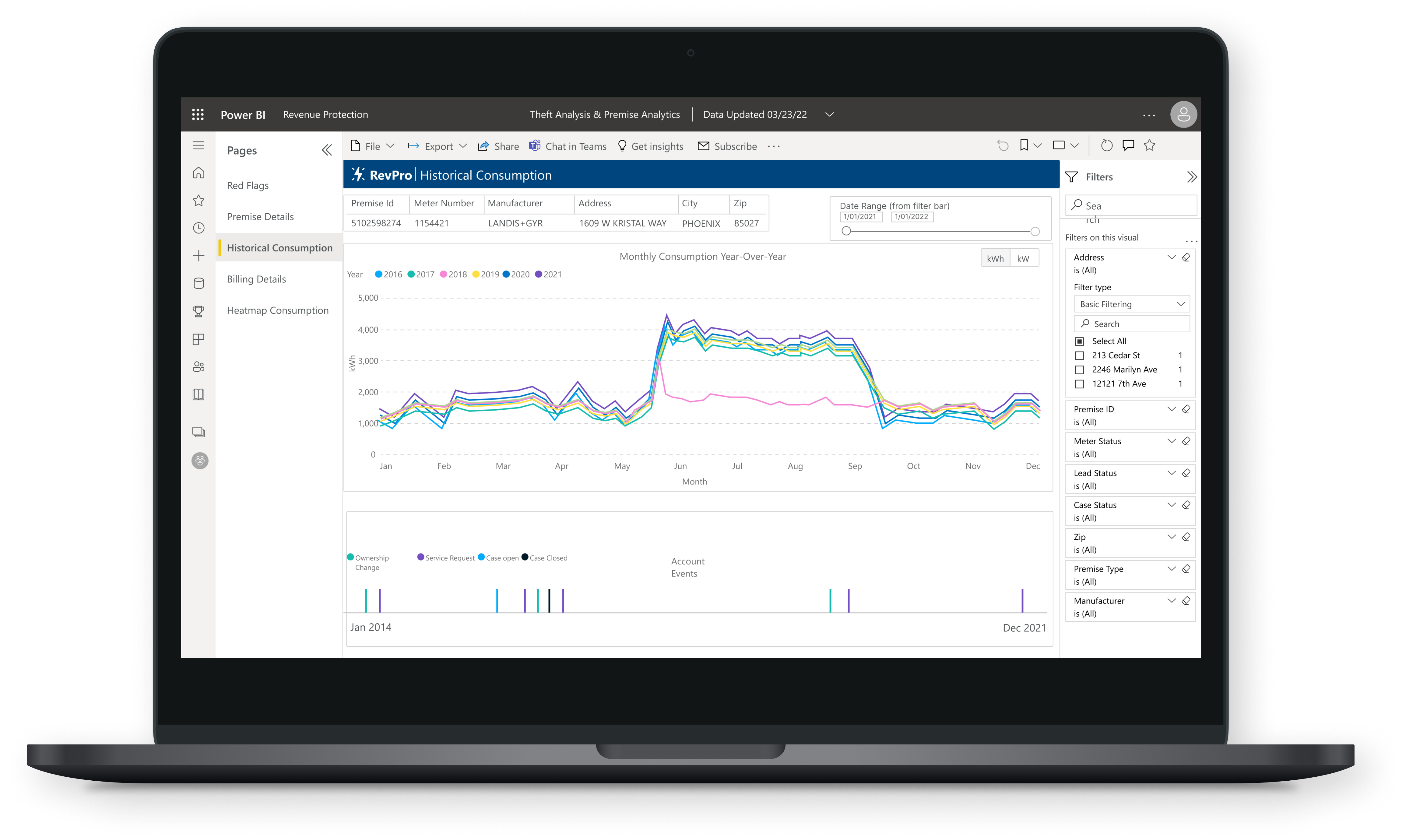
Data Visualization Dashboard
Energy Utility Revenue Protection
A large Energy & Utility company needed to improve their current process of identifying when a customer is stealing power so that investigators could increase safety and revenue protected.
A data visualization dashboard built in Power BI that uses machine learning to identify which properties are the most likely to be stealing power, allowing investigators to work more efficiently.


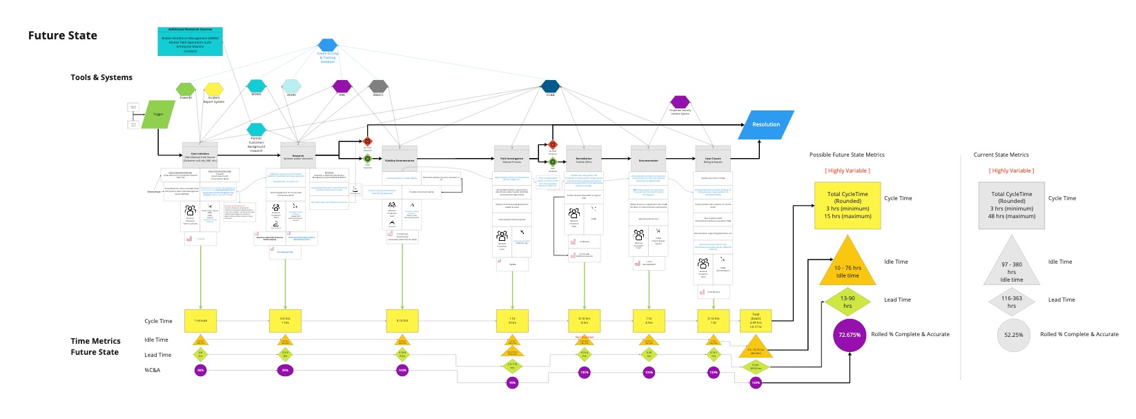
The entire current state process was mapped to understand how the Revenue Protection team accomplishes their work and how the process can be improved.
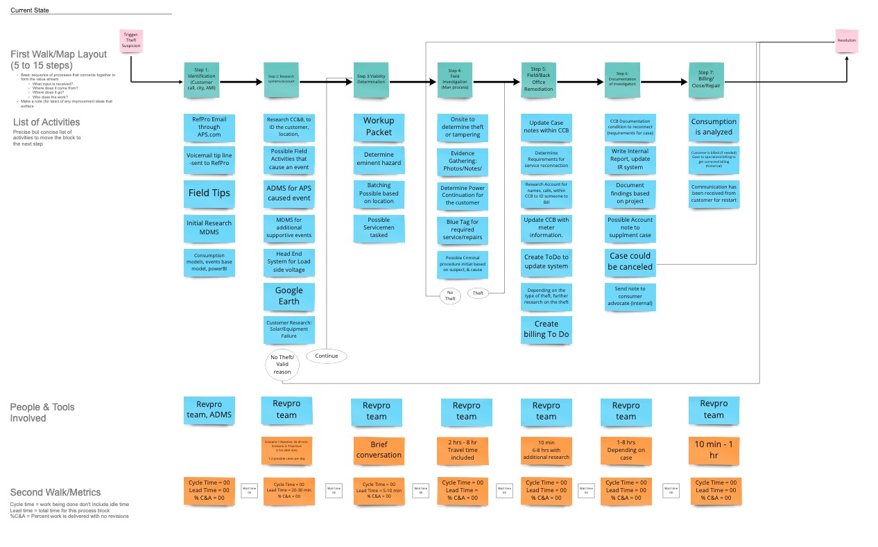
The maps were iterated on several times to ensure accuracy and a final current state was created. The potential improvements were mapped and a future state was created including the total lead, idle, & cycle time improvements.