Graphic Design & Branding

Orange Bitters

My Role

Graphic Designer

Tools Used

Figma, The Noun Project (Icons)

year

2021

About

As a graphic design/branding exercise, I created 11 unique brand identities for the Orange Bitters I had distilled and bottled. I took each design from infancy to final print. Each example contains:

  • Front and Back Labels
  • Unique Branding Style
  • Photos of final product

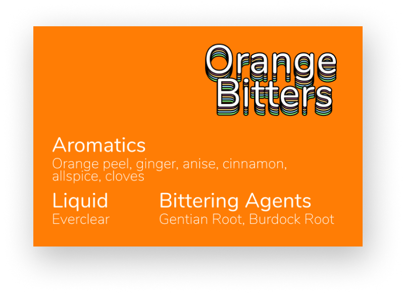
Each one is based off a specific style, idea, or trend that a company or C-level leader might ask for. The aim was to convey the name, branding, and ingredients.

A long green arrow that slides in from the left

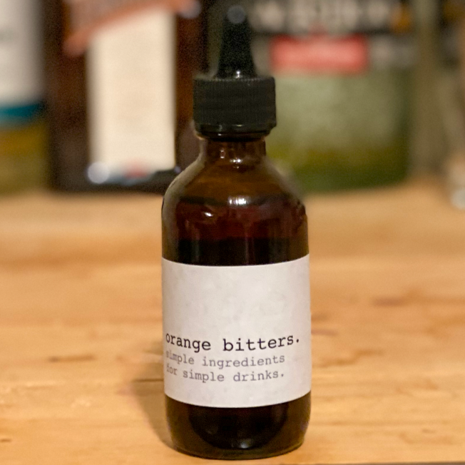
Simple Typewriter

  • For brands who are too cool for colors
  • So simple it doesn’t use capital letters

Bespoke

  • The type of branding that you would see in an Instagram ad for men
  • Selling a lifestyle of rugged sophistication

Comic Book

  • Based on Action Comic #1 (1938) by Joe Shuster
  • Uses modified font to be more ‘heroic’

Sticker

  • Based on the 2021 trend of making everything look like a sticker
  • Meant to look like you could peel the logo off while still being clean

Simple Logo

  • Inspired by logos such as Target, Apple, and Instacart
  • Simple, easy to use, and scalable across an entire branding set

No Text

  • Challenged myself to create a label that used only images
  • Ingredients and instructions take advantage of icons by The Noun Project

Modern Expressionist

  • Based on the trend of using color vibrancy to show how fresh and/or healthy your product is
  • Think fancy organic dried fruit that comes in a food delivery service package

Collegiate

  • For the sports fan who loves to be branded at
  • As a former college marching band instructor, this felt very oddly comfortable

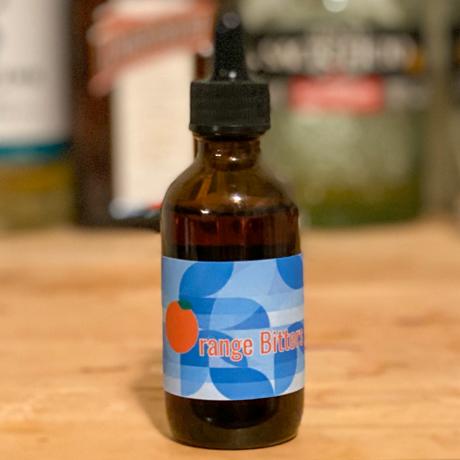
Geometric Patterns

  • A very popular 2021 branding style, for people who love shapes
  • Patterned background created contrast challenges

Heavy Metal

  • A style and branding for a specific demographic
  • Ample use of blurring and skulls

Retro

  • A go-to for any brand is a retro style. No need to reinvent the wheel here
  • Tried and true “The Doors” logo and old-school Doritos inspiration
< Back to work
A long green arrow that slides in from the left

Let's Work Together!

Thank you! Your submission has been received and I will be in touch in the next day or so!
Oops! Something went wrong while submitting the form.
Joe Millea
joe.millea@gmail.com
763.607.7880