Website redesign
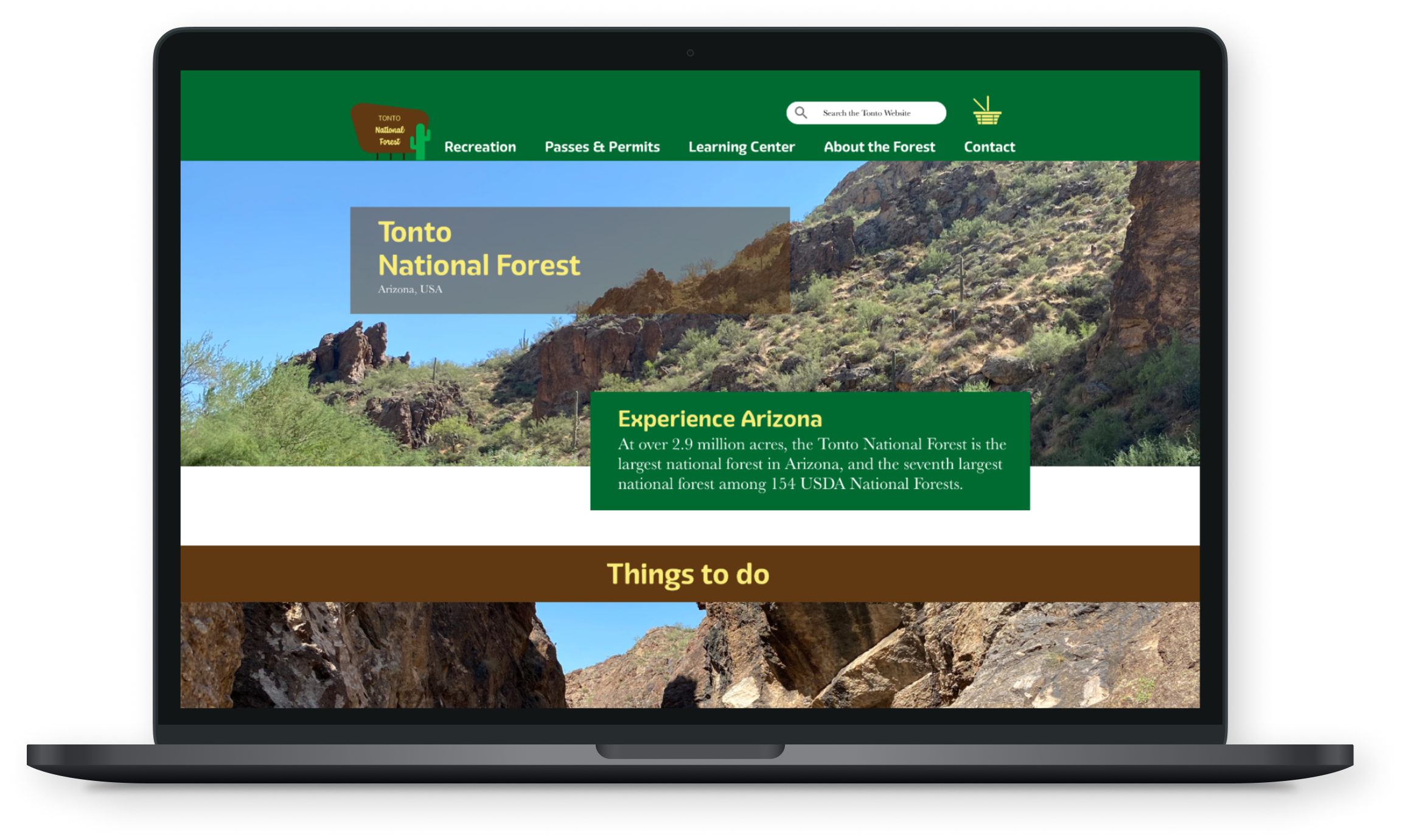
Tonto National Forest

The Tonto National Forest is not user-friendly and is not responsive. Basic tasks are difficult to complete and specific information is difficult to find.
Redesign the website to be more user-friendly, easier to navigate, responsive, and more visually inviting.


Now that I had a good idea of the IA for the site, I sketched out the basic layout of the pages.
I also took a look at some similar sites at this stage to see what some options were. This included:
My number one guiding principle when going from sketches to wireframes was to make sure information is simple and easy to find.